Thursday, December 25, 2008

In-Class Exercise 6 - Back to the Seventies.

Daa da da daaa...I have done my last tutorial for Computer Graphic 2 this semester. So here are the outcome of my work.

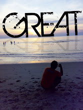
So,here is my result for in-class exercise tutorial 6.

Below are some steps that i use in the making of the last tutorial.
Some shapshot during the making of tutorial 6.

Step 1:
I dragged the picture of a background and paste it on the
basic layer given from the tutorial 6 achieve's fille.

Next,i make new layer and click CTRL+Backspace to fill the new layer.
Then,i applied Filter>Render>Fiber to the new layer.

After that,i change the blending option to Overlay to blend the layer.

Step 2:
Next step,i use Filter>Render>Lighting Effects
and choose Flashlight to add an effect on my layer.

Step 3:
Here,i created a new alpha layer and to Edit Menu>Stroke.

I applied Gaussian Blur to the layer and then duplicated
the alpha channel and i made an offset to both layer.

Here,i use Image>Calculation>Different.

Then, i use the M Curve to make it chrome.

Step 4:
Now,i dragged the picture of the Joker from the Dark Knight movie and applied a Hue/Saturation on the layer to make it grayscale.

Next,i applied Gaussian Blur to the layer.

Then,i add some change using the Levels tool.

Again,i use the M curve to chromed the layer.

Step 5:
I use Blending Mode>Different again to this layer.Then, i make a new selection and add vector mask to the selected layer.

Now,i again applied the Hue/Saturation and choose Colourize
to make the Seventies's layer same as the background colour.

After that,i make a new layer and select it using marquee tool and fill it with white colour using CTRL+Backspace.Then,i use Filter>Render>Lighting effects(Flashlight) to the selected layer.

Lastly,i overlayed the layer and blend it well using the Blending Option tool.

So,this is the final result of my last tutorial.


-Med.tJ

Monday, December 22, 2008

Assignment 2 CG2 : Final Step : Yeah

Yes!!! Finally,i have done my last assignment for Computer Graphic 2 this trimester.So here are some steps that i snapshot to show my in-the-making progress.Firstly, I search some pictures form the net. And I also use some of my own pictures.I gather all the pictures and item that will be put inside the wallpaper.

Drag the picture to the main window.

I use the picture of old paper. I stretch the image to fix the size require.

I type out the text on details and title of the wallpaper.
I apply Drop Shadow and Bevel and Emboss to the text.

As for the pattern, I apply Satin to the text.

As for the time in the details part, I use SuperScript to make it more nice.

I apply Stroke to the text on the bottom-right of the wallpaper.

I apply Gaussian Blur for the text to blend it with the background.

I use Magic Wand to select the shape and then copy the picture.
Then paste it back to the main window.

This is the outcome for the previous step.

After that, I apply Drop Shadow and Stroke for the shape.

I almost done with my wallpaper. I Make some arrangement of the picture and text.

Tadaa!!!
So this is the final outcome...


-Med.tJ

Wednesday, December 17, 2008

In-Class Exercise 5 - Shinigami is a Death God.

There you go. I have done my in class exercise tutorial 5 and here are the pictures are to be use in my in-class exercise tutorial 5.


Now i show some of the steps and pictures that
i snapshot during the making of the tutorial:

Step 1:
I use the brush tool to make the fire ball and color balance to edit some of the layer appearance.

Step 2:
Next,i opened the lightning layer and copy the area that i wanted by selecting it using marquee tool and paste it on the basic layer of the "yoga man".Then,i duplicated the lightning area to add the effect and then i adjust a bit on the layer's opacity.I blend all the lightning layer together.

Step 3:
I open the Mountain Sky layer then flipped it and paste it in the "yoga man" layer.

Step 4:
After that,i change the opacity of the mountain layer and blend and combine all the layer included.

Step 5:
Then,i opened a new layer inside the 'yoga man' layer then i use the brush tool and make a BLACK line around the man's shoulder and head. Afthe that,i use the smudge tool and smudge the black line to make it look like a smoke effect behind the man. Next,i use the gaussian blur effect and apply it to the smoke layer to make it look better.

Step 6:
Then,i opened the yoga man layer,then i delete the base background for future use.

Final Step:
Now,i applied the duplicated layer and combine it in this layer.So,that's the last step of my tutorial 5.

Tadaa!!!

-Med.

Friday, December 12, 2008

Project Charter Assignment 2

Project Charter Assignment 2
************************************************************************************


Assignment 2 Title: Digital Wallpaper

Project Start Date: 12 December, 2008

Project Finish Date: 23 December, 2008.

Project Manager: Mohamed Bin Abd. Aziz

Email: myname_is_mohamed@yahoo.com

Website: http://mcg1014-1061102442.blogspot.com/


**************************************************************************************

Project Objective

Learning process of implementing the multiple tools using Photoshop Software in creating the digital wallpaper regarding ‘MMU FOM Open Day’. In this digital wallpaper, I will be promoting Management Faculty to the people who is looking forward to study in MMU and which courses to be choose and give them some knowledge plus benefit of joining FOM for better future.


Approach

I’m creating digital wallpaper based on the pictures that I have taken via websites and some of my snapshots using the digital camera. Then, I’ll alter them by using the Adobe Photoshop CS2. The wallpaper will be in A4 size,RGB mode color and 8 bits.

In Photoshop, I’m using the all the basic technique that i learned before in and outseide the class and applied it here in the assignment 2 for digital wallpaper.The techniques include layering techniques to rearrange and do some edit part to the images. Plus, I’m using the filter tools also such as Gaussian Blur, Drop Shadow and the adjustment of the colours. Thus, applying the layer mask, crop, lasso tool, shape tool, and etc will make the effect of the wallpaper to be nicer. The inserting of text, I’ll make it look more interesting and informative.


Roles and Responsibilities

1st Phase: Idea is sketched and images are snap and searching through website.
2nd Phase: Images are edited and place inside the wallpaper. Text will be included.
3rd Phase: Consult with Mdm Lydia...
4th Phase: Final touches and last rearrangement are made.
5th Phase: Submission of the Assignment 2.


Comment

This assignment 2 give me challenging for creating the digital wallpaper in a very creativite ways in order to promote Management Faculty and attract people to join my faculty. I need to search so many pictures and references to inspire me and give me more ideas in the making of the digital wallpaper. But,since i like using Adobe Photoshop very much,it makes me more comfortable finishing my assignment. Lastly,i love dealing with Photoshop and i like doing the assignment that is given to me.

-Med.tJ

Thursday, December 11, 2008

In-Class Exercise 4 - Liquid painting is awesome!

I just done my 4th in-class tutorial exercise.So,these are the pictures that i snapshot during the making of the tutorial 4.

1st Step:
I change the color of the word and put an inner shadow effect using the Blending Options tool.

Step 2:
Then, i insert drop shadow and outer glow effect to
make the layer more realistic by using the same tool.
Step 3:
I use Bevel & Emboss to make the shadow and the word's layer looks better.

Step 4:
I make a new duplicated layer and change the mode to grayscale and
use the gaussian blur in the filter tool to make a new layer in the steps.

Step 5:
Next, i add a new layer mask to the background layer and fill it with the Blending Option>>Bevel & Emboss>>Texture to make it look like the above pictures.

Step 6:
After that,i change the layer with editing the Bevel & Emboss
and i change the opacity so it will look like an ice.


Step 7:
I then,use the Gaussian Blur tool again to make the ice looks more real.

Step 8:
Then,i use the marquee tool and cut out the pixel to show the color behind.

Step 9:
Lastly,i use the levels tool to make the outcome better than shown in the tutorial video.

So,here it is!!!

So,this is the final outcome of my fourth tutorial.Hope madam will be satisfy...

-Med.tJ